ZACHARY BAKER is a Graphic Designer and Craftsperson currently located in the beautiful, historic, North End of Detroit. His practice is filtered through craft identity, focusing on publication, motion, & brand identity systems. Scroll below for projects and publications.
See my crafted objects here. Feel free to reach out by email or by phone. The personal details are here.
See my crafted objects here. Feel free to reach out by email or by phone. The personal details are here.
E zachdtco@gmail.com
P 8476100268
Selected
Works
01.5
Case Study
Forgotten Harvest
In the Spring of 2022, we were given the opportunity to refresh the brand identity of Forgotten Harvest, a
non-profit organization dedicated to solving food-based inequity throughout Metro Detroit. Over 15 weeks, our team worked to create a brand refresh that can grow as the company grows and matches the way they see themselves.


02
Research Phase
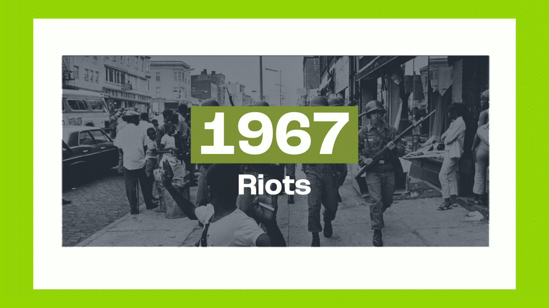
To truly understand the breadth of food inequity in the Detroit Metro Area, it was important to look to the past so that we can understand the present. To start, we took a deep dive into the history of the industry that has long surrounded Detroit, and its eventual decline, creating a visual timeline.
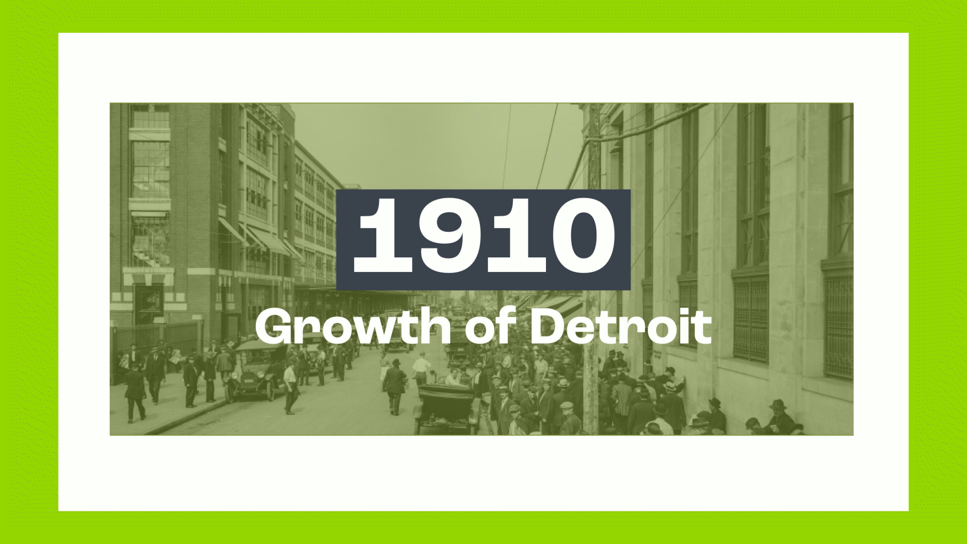
From 1910 to 1950, to 84, and 2007- Detroit has suffered a steady decline within city limits, from white flight, to racial violence, recession, and housing collapse. In 1984 alone, 70 Kroger locations close within the Metro Area, leading to widespread hunger as a result of lack of reseources.
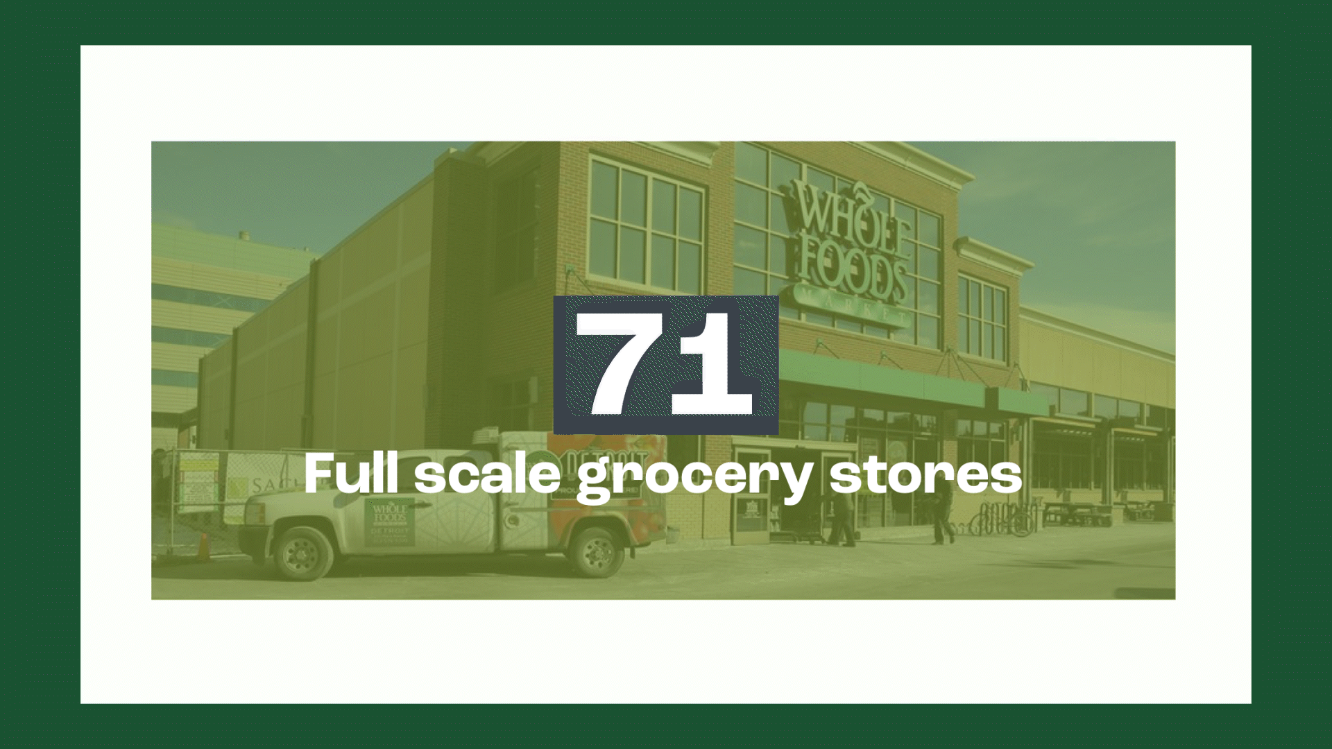
Even today, the issue of widespread food inequity remains at hand, with just 71 full-scale grocery stores in the Metro. It sounds like a lot, but city with similar population density like Seattle, has 401 stores. Individuals within the Detroit Metro are paying 20% more for groceries of far lower quality than in other areas.
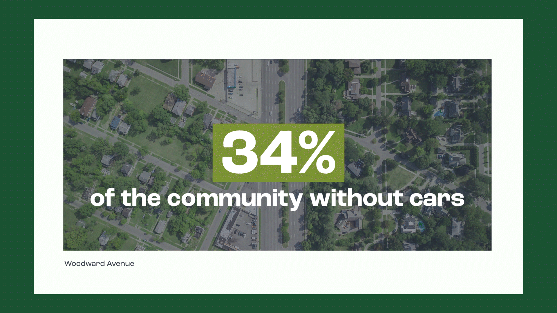
Vacant Housing and Divided Neighborhoods has created a further gap in the distribution of stores, seeing as over 34% of Detroit residents are without personal transportation.High rates of poverty also make financial access to fresh food limited, with over 350,000 people experiencing poverty in Wayne County alone. Followed by Oakland and Macomb, with each County having over 80,000 imporvished individuals.
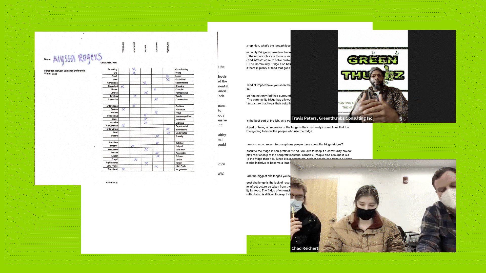
We used a multi-faceted approach to research, splitting into 3 teams, to cover more ground, while also building a comprehensive understanding of Detroit and Forgotten Harvest.
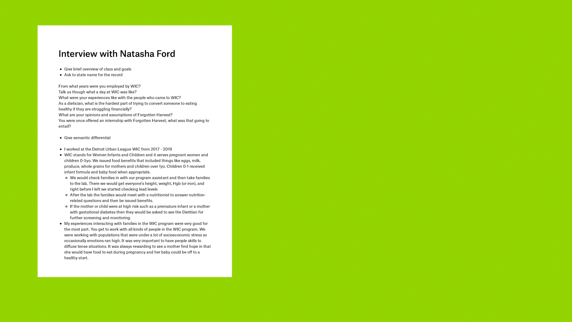
Through current brand analysis, case studies, ethnographic research,interviews and a study on Detroit’s recent historywe presented an encompassing review to the client to ensure we were all on the same page.
02
Language Phase
Following our research, we took a step back to organize ourselves and create a framework of personas that would come to influence the language phase, and furthermore, the fast approaching design phase.
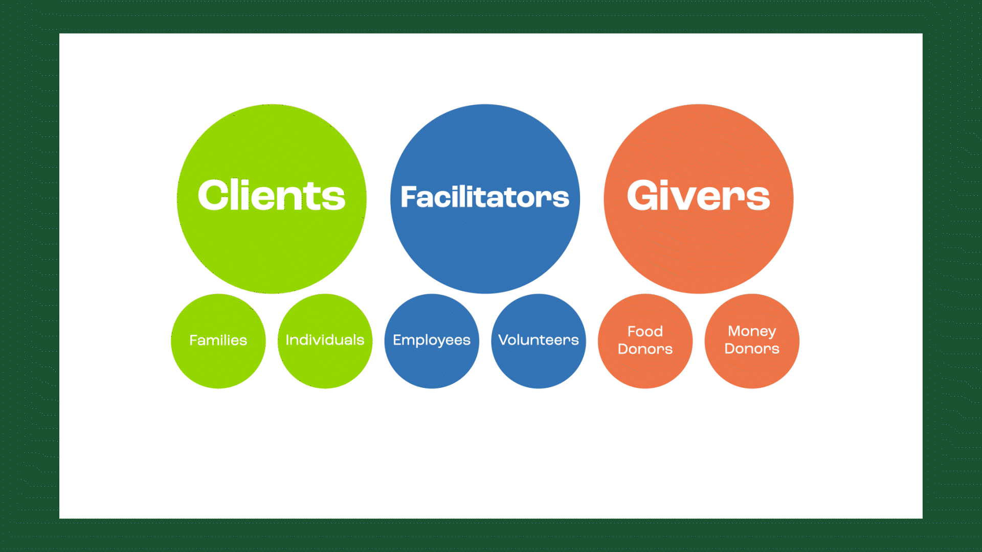
By taking a look at everyone involved in the Forgotten Harvest community, we recognize the way in which community engagement can be broken down into three main categories: Clients, Facilitators, and Givers.
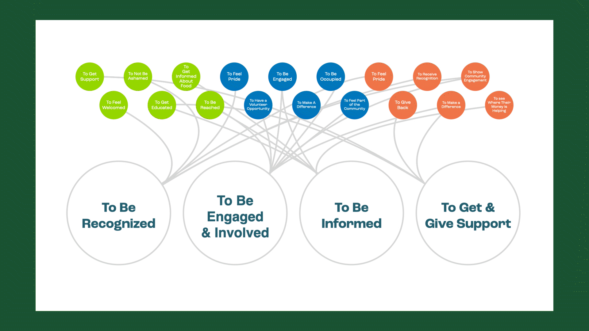
We also began looking into the motivations of each distinct category By further categorizing the motivations, we’ve formulated overarching themes that embody the needs in which our design will address. The themes we’ve identified are:
To Be Recognized, To Be Engaged and Involved, To Be Informed, and To Get and Give Support.
Brand Essence:
We plant seeds of hope that will engage, inform, and empower a better tomorrow
Promises:
We Plant: we promise to build awareness and recognize potential.
We Cultivate: we promise to empower and engage community at all levels.
We Harvest: we promise to celebrate success and opportunities realized.
We Cultivate: we promise to empower and engage community at all levels.
We Harvest: we promise to celebrate success and opportunities realized.
03
Moodboards
04
Design Phase
Pulling imagery and case studies from our moodboards, we created two distinct directions based on different interpretations of our brand promises and essence.
In our informal studio presentation, we were able to show our preliminary ideas dually, one direction being conservative and structured(above); and another being friendly and organic(below).
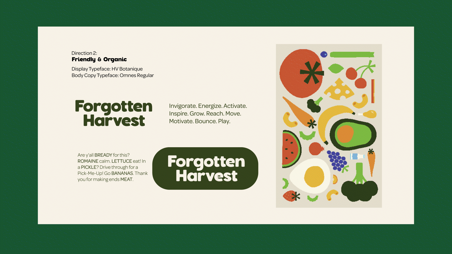
Our system starts small, growing, and expanding, from seed to stem.
05
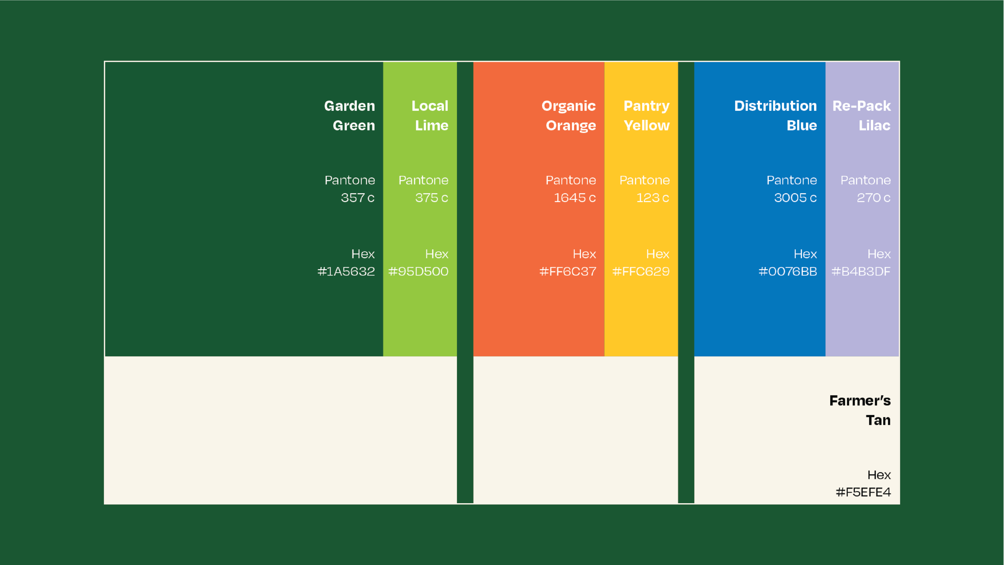
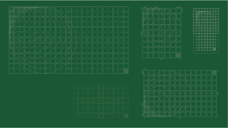
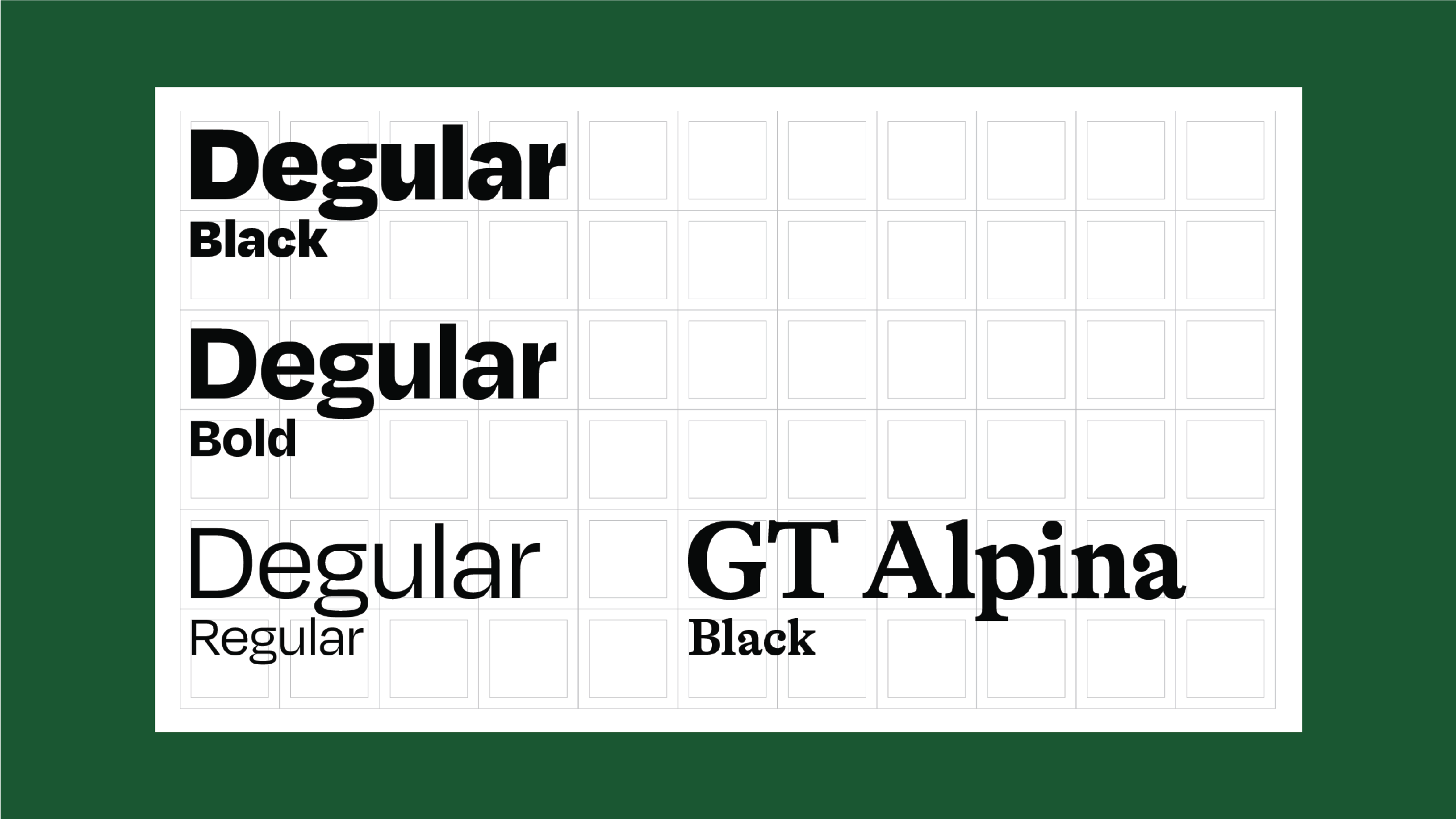
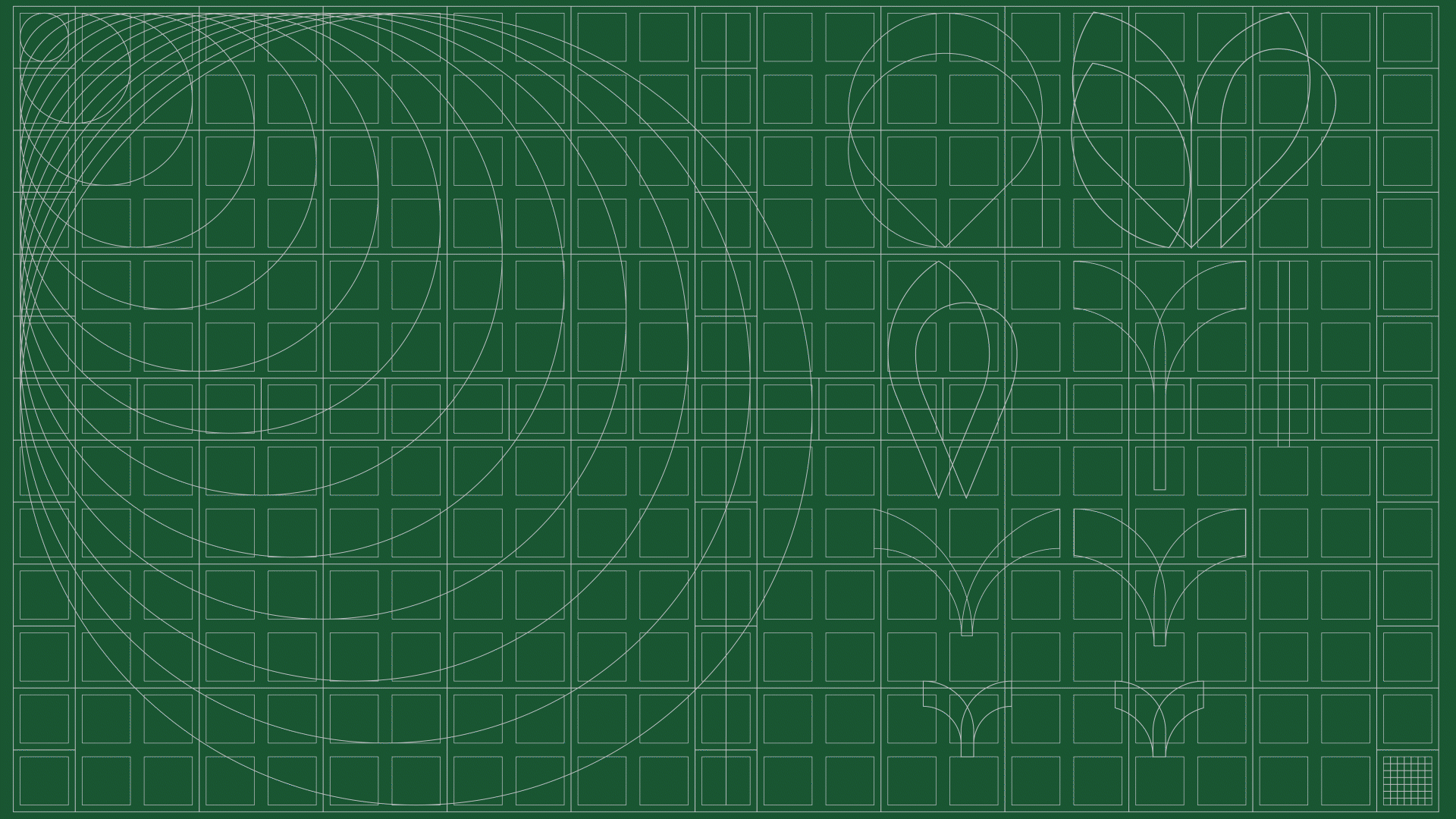
Color, Grid, & Typography
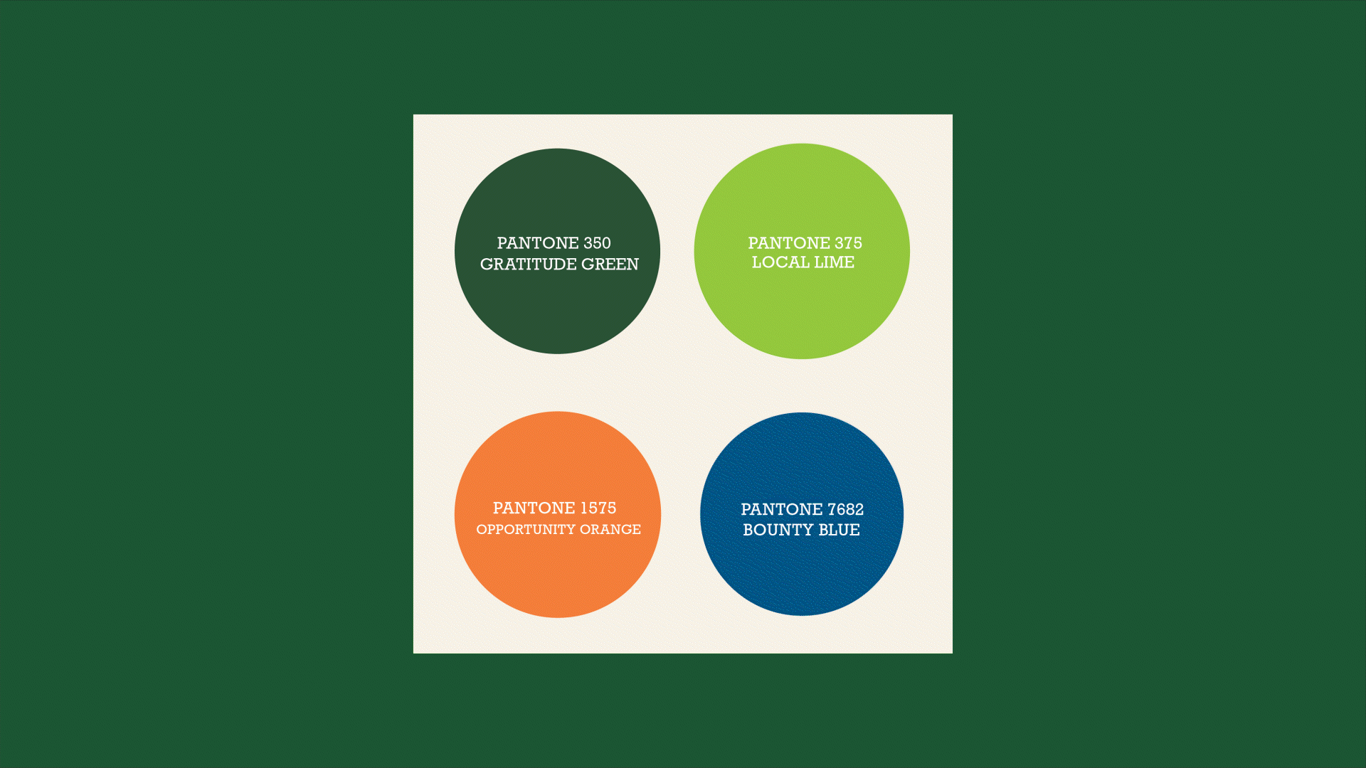
Forgotten Harvest’s orginal brand weighed heavily on the color green. A valuable peice of their existing identity that the community was readily familar, and comfortable with. We established early on that it would be indespensable to retain the initial green, or similar shade as the primary identifier of brand.
After days and days spent testing, changing, and tweaking; we decided on our refined pallette that not only engages the community through friendly vibrancy, but engages the individual communities within Forgotten Harvest as a whole- a color for everyone.